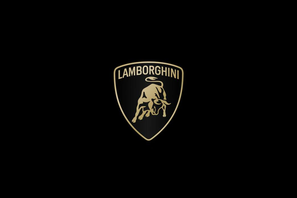
Lamborghini has introduced a redesigned version of its iconic raging bull logo for the first time in over two decades. The updated logo features a revamped font and a bull with a diminished 3D appearance. According to Lamborghini, these changes better embody the brand’s “brave, unexpected, and authentic” values.
The alterations to the logo are subtle, making them easy to overlook for those not deeply invested in Lamborghini’s history or logo design. The new crest has been subtly refined, shedding some of its former three-dimensional depth.
Additionally, the “Lamborghini” typeface at the top of the logo now boasts a “wider” appearance, part of a new official Lamborghini typeface crafted to echo the angularity of its vehicles.
Lamborghini asserts that the updated logo signifies more than just a superficial badge refresh; it is a pivotal element in a broader transformation of the brand. It is intended to better encapsulate the brand’s core values of bravery, unpredictability, and authenticity, encapsulated in its mission of “Driving Humans Beyond.”
The primary colors of the logo have transitioned to black and white, with yellow and a new gold hue serving as accent colors. Immediately following its debut, the brand began showcasing the new logo across its social media platforms, notably without the shield.
This move aims to amplify the iconic bull by allowing it to stand alone, separate from the crest. However, the shield will continue to adorn Lamborghini’s vehicles proudly.
The decision to present the shieldless bull exclusively in the digital realm assures fans that it remains a cherished symbol, preserved for its physical presence on Lamborghini automobiles.